
Date: 2025
Project Type: Web Design
Introduction
TechSpark Summit was created as a conceptual event platform in partnership with Bash Events. The TechSpark platform was created to connect people with innovation, technology and immersive experience. The goal of this project was not just to design a website, but to create an experience that feels clear, engaging, and easy to move through. I wanted users to land on the site, understand the value immediately, and navigate without second guessing their next step. This case study walks through how I simplified a complex event experience into something structured, intentional, and user focused.
Problems & Goals
The idea behind the TechSpark Summit website started with a simple observation. A lot of tech event websites feel overwhelming. When I searched existing platforms, I kept running into the same issues, too much information, unclear structure, and layouts that make users work harder than they should just to understand what the event is about.
For this project, the challenge wasn’t about promoting the event. It was about clarity. I wanted users to quickly understand the value, explore key information like speakers and exhibits, and move into registration without difficulties.
My goal was to design something that feels modern, organized, and welcoming. I wanted the site to have energy, but still feel controlled and professional. Not too busy, not too plain. Just enough to grab attention without overwhelming the user. The focus was always on balance keeping the experience exciting while making sure it stays easy to understand.
Users & Audience
The audience for TechSpark includes college students, aspiring tech professionals, creatives, entrepreneurs, and anyone curious about innovation. These users come from different backgrounds, but they all share the same mindset. With research I noticed users are looking for growth, connection, and new opportunities.
Some users want to network. Others want to learn from speakers or explore new ideas. Some just want to attend something that feels worth their time and money. What they all need is clarity. They don’t want to dig through clutter or guess where to go next.
That’s where most event platforms fall short. Users get frustrated with messy layouts, unclear messaging, and checkout flows that feel disconnected. My goal was to remove that friction and give users a straightforward path from interest to action.


User Journey
The TechSpark journey starts with discovery. A user lands on the homepage and immediately asks, “What is this, and why should I care?” That first impression matters. If the value isn’t clear, they’re gone.
From there, the user moves into exploration, which consist of browsing speakers, checking exhibits, looking at event details, and planning their visit. This part of the experience needs to feel smooth and natural. No confusion. No second guessing.
As the user continues, they move into decision mode. They’re evaluating whether the event is worth attending. This leads into registration and checkout. If that process feels confusing, the user drops off. If it feels clean and easy, they will complete the process.
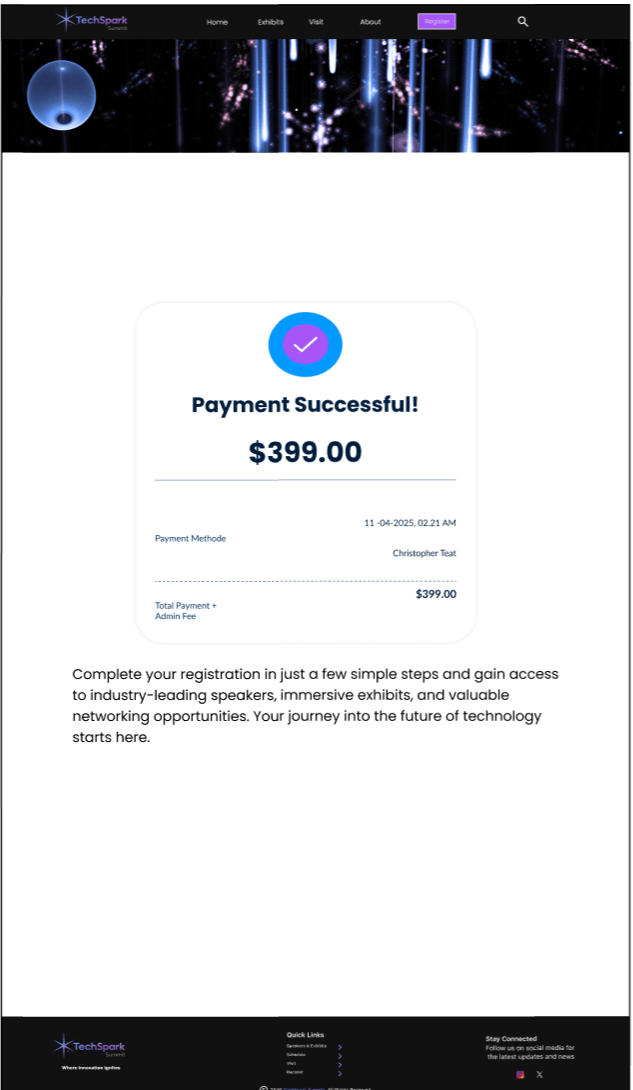
The final step is confirmation. This is where the user should feel reassured that everything is done correctly, and they know what’s next.
The entire journey is built around one idea, and that’s reducing confusion and creating momentum. Each step should feel like a natural continuation of the last.

Development
Process & Structure
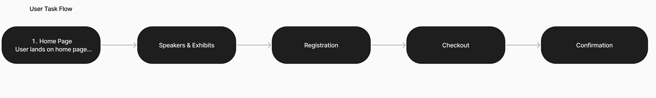
I approached this project by focusing on structure first before visuals. I used journey mapping and task flows to understand how users move through the experience from discovery to confirmation. This helped me identify where confusion could happen and how to remove it early.
User Flow & Task Flow
The user flow was built around a path of simplicity. I wanted the user to enjoy the experience from beginning to end. I created a task flow for the user to simply Discover, Explore, Decide, Register, and Confirm. I made sure every step connects cleanly to the next. No dead ends. No confusion about where to go. The task flow focused on one main goal, which is getting a user from interest to completed registration without friction. Every decision in the layout supports that goal.
Style Tiles & Visual Direction
Typography
Once the structure was solid, I moved into visual direction using style tiles. I selected Poppins as the primary typeface because it feels modern, clean, and easy to read across all sections of the site. It supports the tone I was going for professional but still approachable especially in a Tech based setting. There were solid fonts such as Inter, and Montserrat in the running, ultimately Poppins stuck out to me for readability.


Buttons & Icons
The buttons were designed to be clear, easy to recognize, and placed where users naturally expect to act. Each one uses simple labeling and strong contrast to guide users forward without confusion or hesitation.


Logos
For the creation of TechSpark’s logo, I wanted to create an image that’ll reflect energy. There were a few ideations prior to the final design. I wanted to focus on a clean design that aligns with the overall experience of the website. I wanted to create something that supports the brand without distracting from content.

Wireframing Approach
Low-Fidelity
Starting the wireframe process I initially wanted to create the “About” and “Visit” pages. I didn’t fully have the confidence in displaying Call to Actions on those pages, which led to a slight pivot in the design flow.
These initial layouts focused on experimenting with structure, navigation and content hierarchy. During this stage I gained understanding how users might move through the sight, but not really grasp the flow when trying to purchase tickets. These wireframes were set aside ultimately due to the full development of the user flow but will be revisited at a later development stage.


Mid & High-Fidelity
From there, I built out wireframes in Figma. I focused on the core screens that matter most to the user based on pain points and user experiences. The core screens I focused on were the Home, Speakers/Exhibits, Registration, Checkout, and the Confirmation page.
The Mid-fidelity and High-fidelity wireframes were built to prioritize clarity over complexity. Instead of overwhelming the user with everything at once, I structured the content, so it unfolds naturally as they move through the site.
The Home page introduces the event and sets the tone. The Speakers/Exhibits page allows users to explore value. The Registration and Checkout pages are designed to feel simple and controlled, reducing users abandoning the site. The Confirmation page closes the experience with clarity and reassurance.


Design Decisions
Every design decision came back to one question during the project. Does this make the experience easier for the user? That question alone allowed process of elimination with several iterations. If it didn’t work well, it didn’t stay. Navigation was simplified to reduce confusion. Content was grouped intentionally to improve user search. CTAs were placed where users naturally expect them. The overall layout avoids clutter while still feeling full and engaging.
Closing Thought
This project pushed me to focus on clarity over everything. It showed me that good design isn’t about adding more, it’s about knowing what to leave out.
If this project were to continue, the next steps would include moving into testing user interactions and building a working prototype. Structurally, the foundation is already there. I wanted to create a user-focused experience that guides people from curiosity to commitment without making them think too hard.