
Date: 2025
Project Type: App
Introduction
Simple Spoon was created as a food and recipe app with a focus in accessibility, confidence, and easy use for a beginner cook. During this project I was able to explore how design can make cooking feel more welcoming by breaking task into simpler steps and presenting features in a clear, supportive way. Roles/Responsibilities
My role for this project included exploring target users, creating and organizing content and features, and strategizing the overall user experience. I also structured the app, sketches, wireframes, and design decisions that supported the needs of beginner cooks. I wanted to build an experience based on transparency, usability, and encouragement for the beginner cook. Once the overall layout of the app was completed, I conducted a task-based paper prototyping and usability test to evaluate how the user complete each task, along with discovering key pain points of the user.
Background
Through surveys and research, users made it clear they wanted simplicity in their use of a beginner friendly food app. They want Instructions that are easy to follow, layouts that are clean and not overwhelming, and support while they are actively cooking.
User behavior also showed that people skim through necessary steps rather than reading everything in detail. They rely on the visual display and clear directions to understand that to do next in their steps. During my research process I’ve noticed when given too much information, users tend to lose focus. This insight reinforced the reduction of cognitive load throughout the experience.
User Needs & Persona Prioritization
Through surveys and research, users made it clear they wanted simplicity in their use of a beginner friendly food app. They want Instructions that are easy to follow, layouts that are clean and not overwhelming, and support while they are actively cooking.
User behavior also showed that people skim through necessary steps rather than reading everything in detail. They rely on the visual display and clear directions to understand that to do next in their steps. During my research process I’ve noticed when given too much information, users tend to lose focus. This insight reinforced the reduction of cognitive load throughout the experience.

Object Mapping
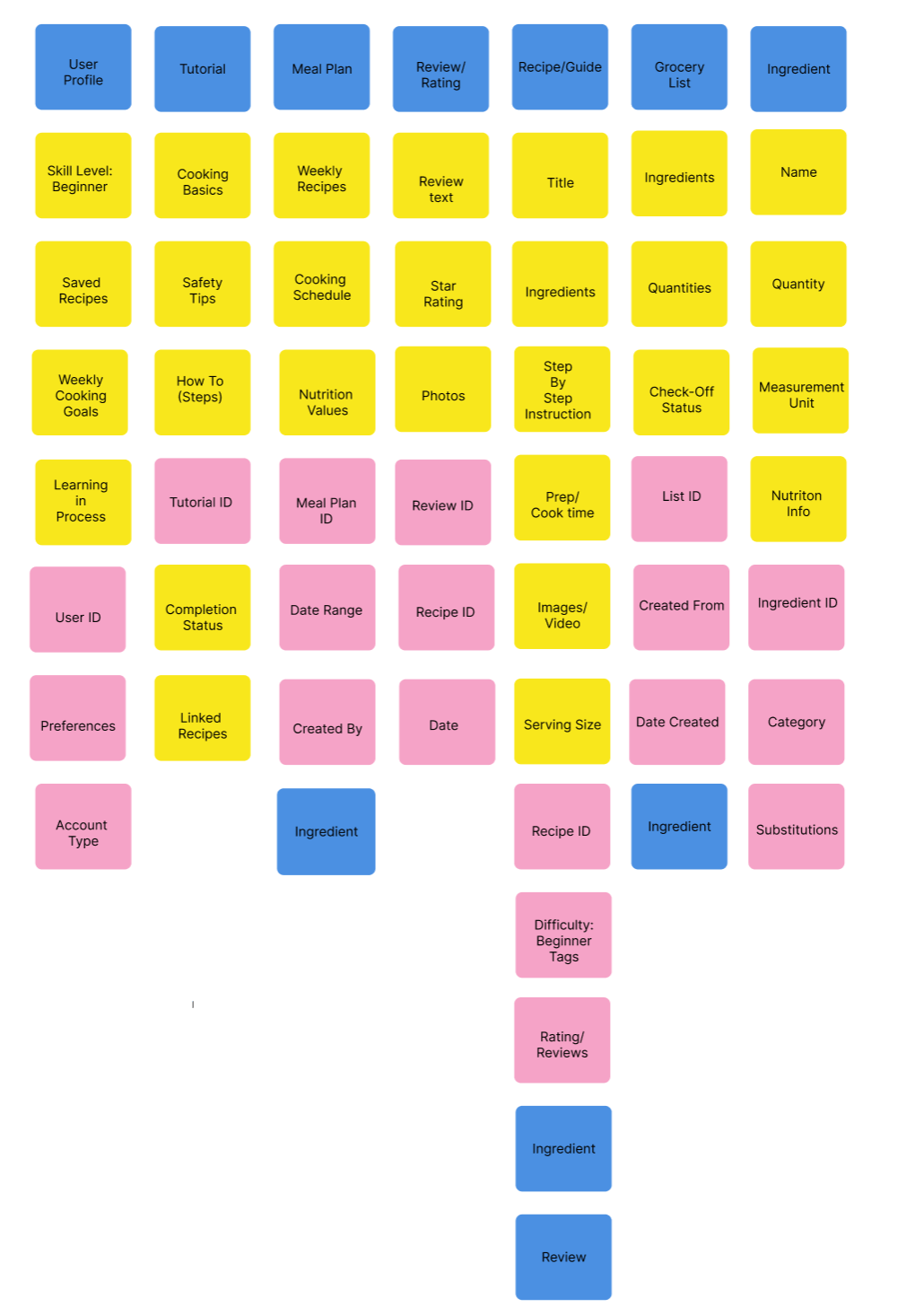
The Simple Spoon App was built around key components that supports the User Journey. The main components include the User Profile, Tutorial, Meal Plan, Review/Rating, Recipe Guide, Grocery List, and Ingredient. These components are all working together to support the beginner user. The Recipe/Guide works as the core of the experience, containing step by step Instructions, Ingredients, and Cooking Details. The Grocery List supports preparation and organization. Additional elements like Meal Planning helps users beyond just cooking, it allows them to build consistency and confidence over time. This process held ensure the app was structured in a way that feels clear, connected, and easy to navigate during the process.
Problem Statement
Recipe and cooking apps are built for people who feel comfortable in the kitchen. For the beginner cook this can leave them feeling overwhelmed and often discouraged when attempting to cook meals. New cooks want to prepare meals at home; however, many feel discouraged by instructions, options, and lack of guidance. The Simple Spoon app help new cooks feel confident in their journey, while creating an experience that’s organized, and supported throughout the cooking process.
Background Journey Mapping
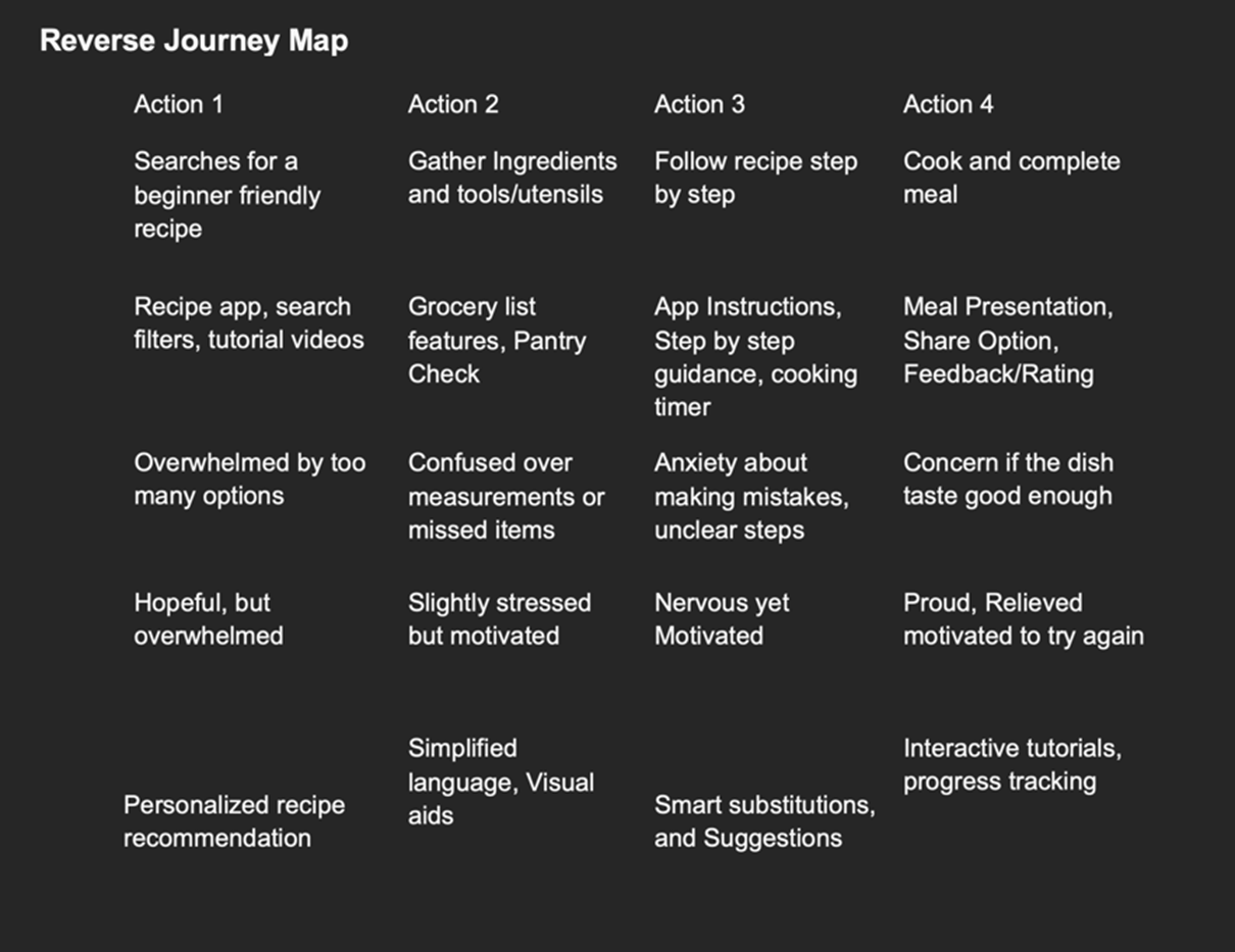
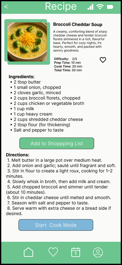
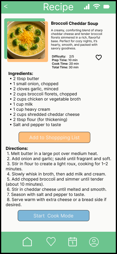
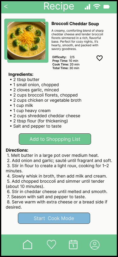
The core experience of the app is centered around the Recipe/Guide structure, which includes ingredients, step-by-step instructions, and key cooking details. This represents the main point where users interact with the product to complete their goal.
A reverse journey mapped was used to understand how users reach the final goal of competing a recipe. The process was mapped backwards through steps such as following instructions reviewing ingredients, and selecting a recipe. This helped identify pain points like confusion when given too much information.
Feature Exploration & Prioritization
Multiple features were explored, including guided cooking, timers, shopping lists, and meal planning. The focus was on identifying which features support the user versus which ones add unnecessary complexity.
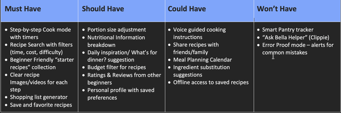
The MoSCoW analysis prioritized features based on what a beginner user needs to complete a recipe.
The Must have features include Step-by-Step cook mode with timer, Recipe search, Starter Recipes, Clear recipe Images, Shopping List generator, and Save and Favorite Recipes. The Should-have features like Ratings and Reviews, and Budget filters for recipes can improve the experience but are not required. Could-have features such as meal planning, share recipes, and Voice Guided Cooking add value but are not essential. More advanced features were excluded to keep the app simple and focused.
Design Development
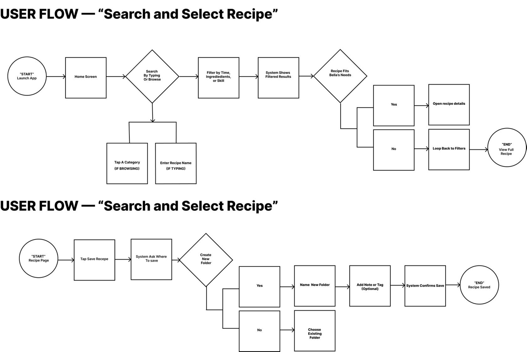
Task flows were created to outline how user’s complete goals, such as finding and cooking a recipe.
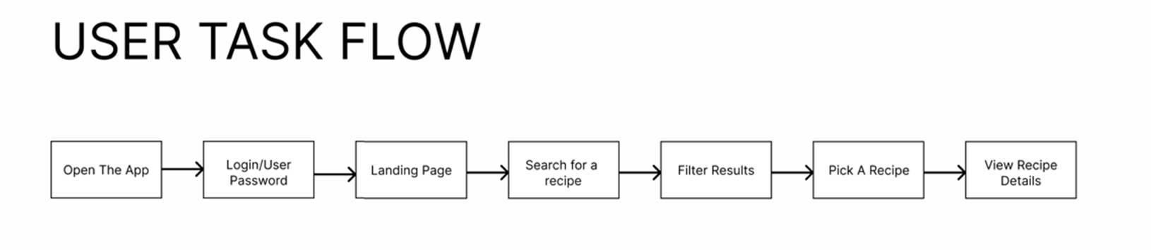
User flows were then used to show how those tasks are completed within the app itself. This helped ensure that navigation and interaction patterns were clear and consistent.
Within the app the user flow includes opening the app, logging in to the user account, Viewing the landing page, using the search feature to find a recipe, selecting a recipe, reviewing the ingredients, preparing items from a grocery list, and the cooking the meal step by step.
These flows helped clarify how users move from deciding what to cook, to completing a recipe. This made it easier to design a structured and straightforward experience that supports users during the process.
UI Design & Prototyping
The visual design focused on clarity and ease of use. Typography was kept simple and readable I went with a San-serif typeface, layouts were clean, and icons were used carefully to support understanding rather than replace it. The goal was to create an interface that feels approachable and easy to navigate.
Iconography
The UI iconography for Simple Spoon App was designed to support clarity and ease of use for a beginner user. Icons were carefully selected to represent common actions such as searching, saving recipes, accessing the grocery list, and navigating the meal planner, using familiar visuals like the magnifying glass, heart, calendar, and checklist.
Each icon was assigned a placement category primary navigation, contextual, management, or ancillary to ensure consistency and reduce confusion across the app. Additional icons were used to support recipe details, such as prep time, difficulty level, and nutritional information, helping users quickly understand key information without needing to read through everything.
Overall, the icon system was built to be simple, recognizable, and supportive of a smooth user experience.

Low-Fidelity Prototypes & Testing
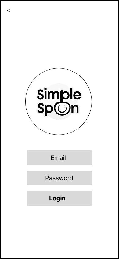
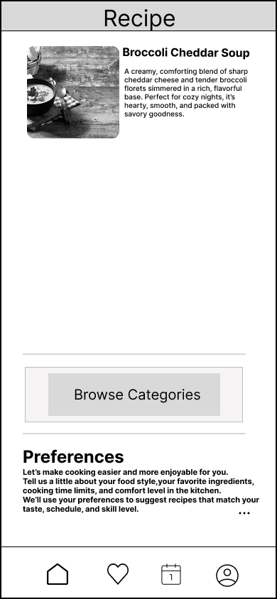
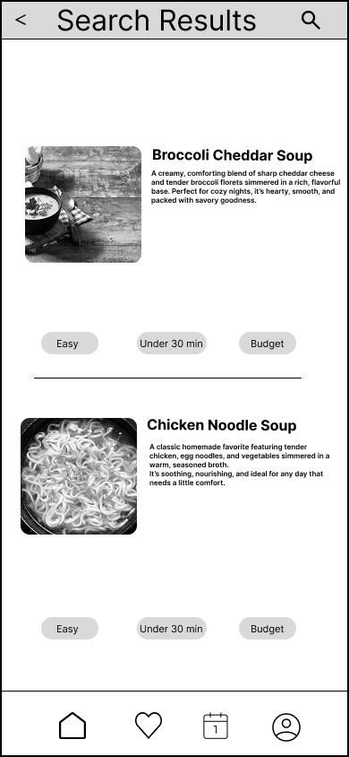
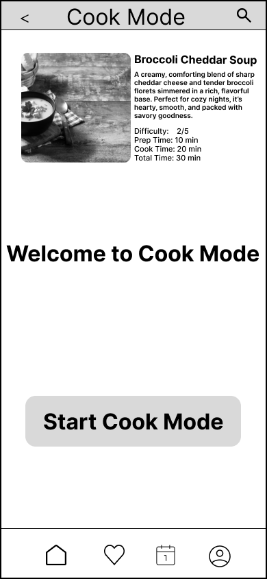
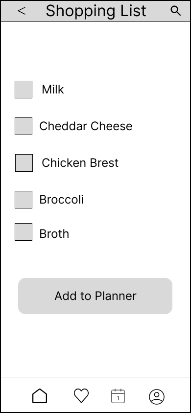
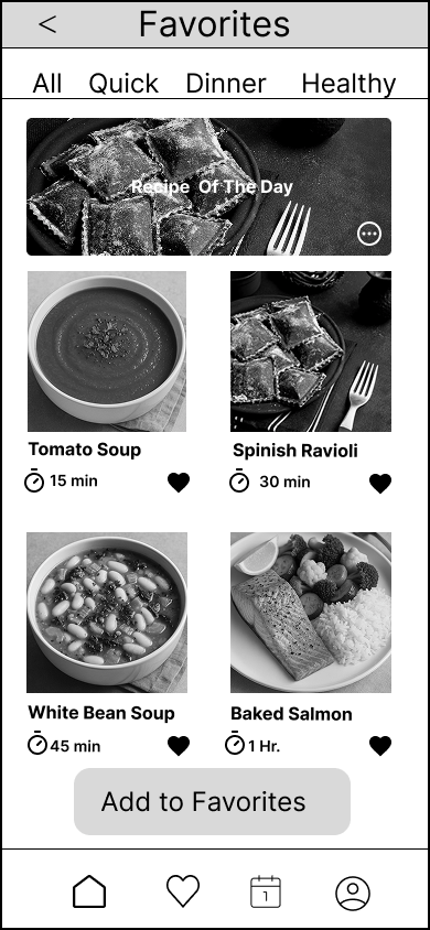
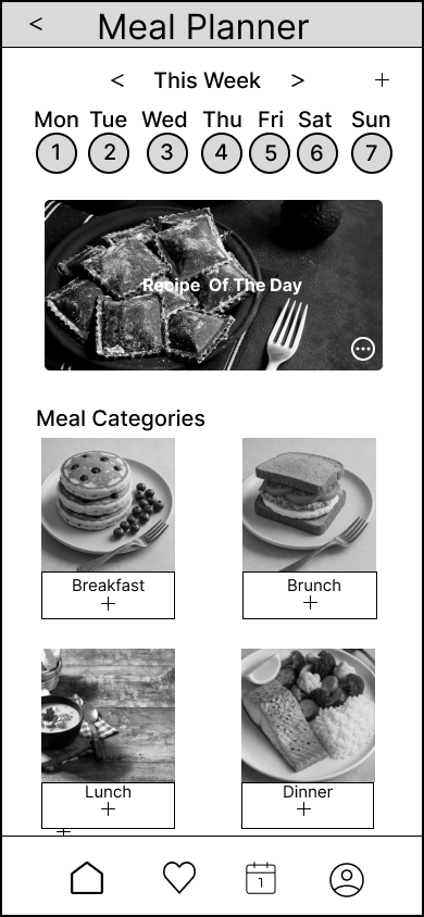
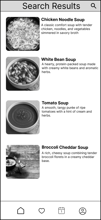
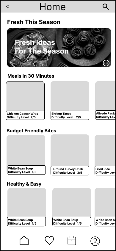
The Low-fidelity prototyping for Simple Spoon was completed using wireframes created in Figma, I wanted to focus on layout, structure, and user flow rather than hand-drawn sketches. The wireframes represented key user interactions such as signing in, finding a recipe, and saving recipes for later.

Paper Prototyping Test
Brief Description of the System
Simple Spoon is a beginner-friendly recipe and meal-planning app designed to help users like “Beginner Bella” confidently prepare quick, budget-friendly, and healthy meals. The app focuses on simplicity and guidance for users who are new to cooking. Key features include:
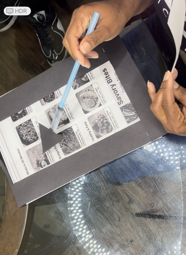
A personalized sign-in and onboarding experience, Recipe discovery through filters like ‘Under 30, Minutes’, ‘Budget-Friendly’, or ‘Healthy & Easy’, Ability to save favorite recipes for quick access,
and a Step-by-step Cook Mode for hands-free guidance.
The goal of the usability test was to determine if new users could successfully navigate the app’s core functions with minimal instruction.
Task Supported by Paper Prototype
Task 1: Logging In for the First Time
Scenario:
You downloaded the Simple Spoon app a while back and are finally ready to get started using it. You remember creating an account before but aren’t sure where to begin. Use the system to sign in and get ready to start using the app.
Purpose:
To evaluate whether users can successfully locate and use the sign-in process without confusion.
Observations:
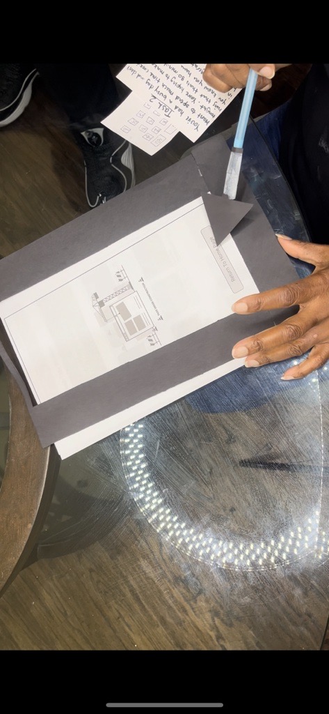
Users found the “Sign In” button clearly labeled on the home screen. Some testers hesitated between “Sign In” and “Create Account” due to similar styling. Once logged in, the transition to the home screen felt smooth and consistent.
Feedback Summary:
Make an edit to login button on login page. Include a brief confirmation screen or welcome message after logging in.
Task 2: Finding a Quick Recipe (30 Minutes or Less)
Scenario:
You’ve had a busy day and don’t want to spend much time cooking tonight. You’re hoping to make something that takes 30 minutes or less. You know you have some broccoli in your refrigerator that needs to be cooked. Find a recipe you like that fits this time limit.
Purpose:
To assess how easily users can apply filters, search by ingredients, and select an appropriate recipe.
Observations:
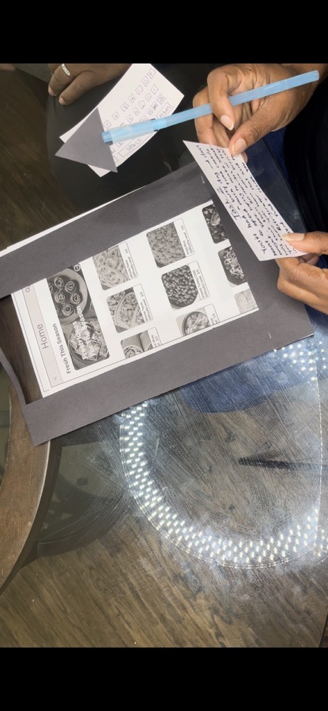
Most testers successfully used the “Time” filter or “Quick Meals” category. Some users typed “broccoli” in search but didn’t notice the filter options at first. Recipe cards were easy to browse but could use clearer indicators for prep/cook time.
Feedback Summary:
Add visible icons or tags such as ’30 min or less’, ‘vegetarian’, or ‘budget-friendly’. Make filter options more prominent or pre-suggested based on search terms.
Task 3: Saving a Recipe for Later
Scenario:
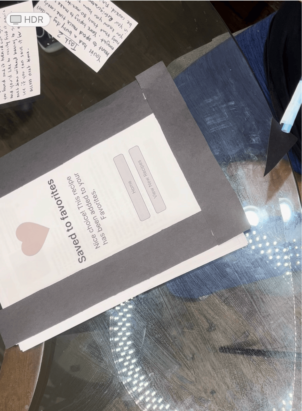
You just finished cooking the recipe you found, and it turned out great. You’d like to easily find it again next time without having to search. See if you can save it for quick access next time.
Purpose:
To test whether users understand how to favorite or bookmark recipes and later retrieve them.
Observations
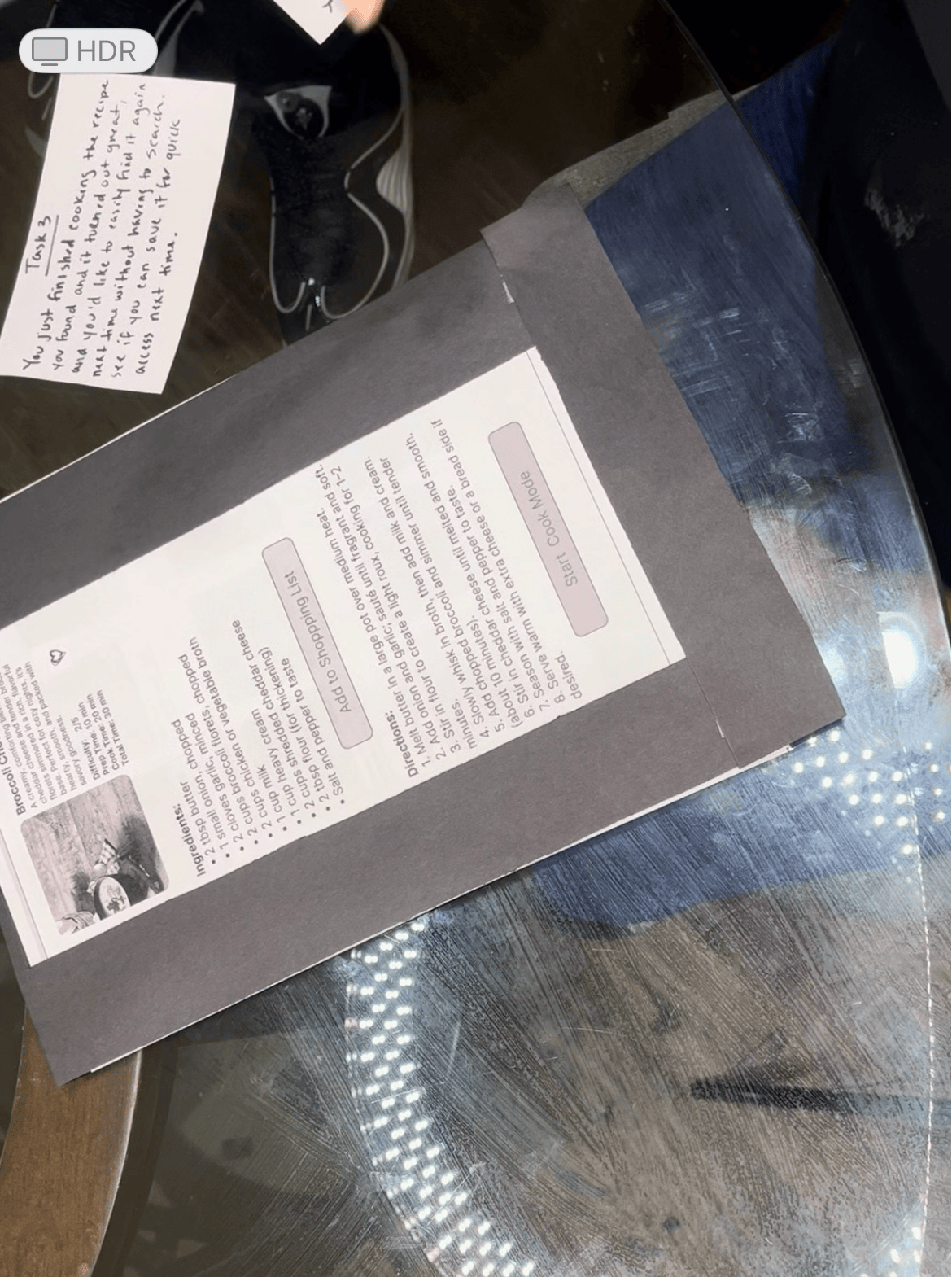
Most testers recognized the heart icon and successfully saved the recipe. However, a few expected a confirmation message. Navigating back to “Favorites” was easy using the bottom navigation bar.
Feedback Summary
I gathered that I should add a ‘Favorite Added’ confirmation message in the favorites section.
Also, I noticed I should ensure consistency between the favorite icon on recipe cards and in full recipe view.
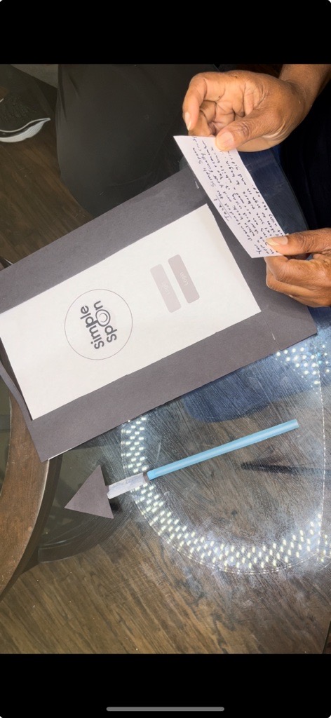
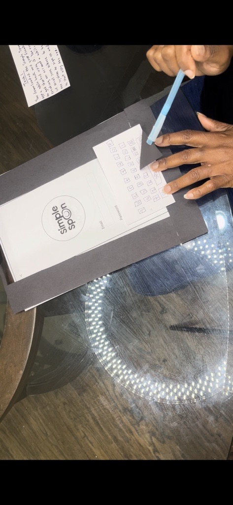
Pictures of Prototypes Being Tested
The images listed in the test were the login screen, recipe search, favorites section.
5 Things to Change / Design Differently Based on Testing Feedback
During the test I noticed the Filters for the “30 Minutes or Less” and “Healthy Meals” they were not easily noticed. However, my solution was to make the filters persistent and visually highlighted when active. Another Problem was the Recipe cards. IU noticed they lacked quick visual cues for time, cost, and health categories. My Solution would be adding small, color-coded icons or tags for clarity.
I didn’t notice a confirmation appear after saving a favorite. I would have to Include a brief confirmation message (‘Added to Favorites’). Some users weren’t sure where to find saved recipes.
I would have to Add a visible ‘Favorites’ icon in the bottom navigation labeled Favorites or My Recipes.
User Survey
To better understand user behaviors and frustrations surrounding recipe apps, I conducted a user survey focused on cooking habits, confidence levels, and mobile app usage. The findings showed that many users were beginner or intermediate cooks who often felt unsure when trying new recipes. A large percentage of participants also expressed concerns about making mistakes while cooking, which reinforced the need for a more guided and beginner-friendly experience.
The research also revealed that most users rely on smartphones when following recipes, helping support a mobile-first design approach for Simple Spoon. Participants responded positively to organized layouts, step-by-step guidance, and clean visual presentation. These insights directly
influenced features such as Cook Mode, simplified navigation, and the overall warm, approachable visual style used throughout the app.
Cooking Skill level
Most participants identified as beginner or intermediate cooks, reinforcing the need for a simple and approachable cooking experience.

How Users Feel When Trying New Recipes
Many users expressed feeling unsure when trying new recipes, which influenced the decision to create more guided and supportive user flows.

Cooking Challenges / Fear of Messing Up
Fear of making mistakes was one of the most common frustrations users experienced while cooking, helping shape features like Cook Mode and simplified instructions.

Smartphone Usage
Many users relied on smartphones while cooking, supporting a mobile-first design approach with larger touch targets and simplified navigation.

Recipe App Pain Points Graph
Users commonly struggled with cluttered instructions, too many steps, and difficulty revisiting recipes, which influenced the app’s cleaner layout structure.

Refinement
Based on testing and feedback, several refinements were identified. These include improving icon clarity by adding labels, refining the Cook Mode experience, and enhancing navigation to make key features easier to find.
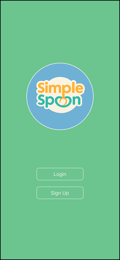
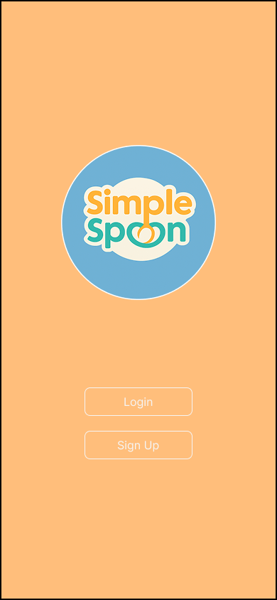
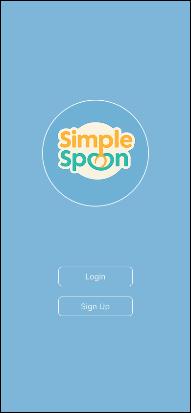
Visual design elements such as color and spacing were also adjusted to improve readability and overall usability. The goal was to keep the logo simple and aligned with the overall feel of the app. The early design featured the app name with a bowl dropping down from the letter “P”, which connect to the “O” letters in the word Spoon. I explored several color variations before landing on a green and orange palette. The colors were chosen to feel warm and inviting, helping create a welcoming experience for beginner users.
Next Steps
If this project were to continue, the next steps would include conducting higher-fidelity testing, building a working prototype, and expanding features like filtering and meal planning. The focus would remain on maintaining simplicity while gradually adding value to the experience.
